I was recently listening to an episode of the Jason Stapleton Show (I believe this is the episode https://jasonstapleton.com/822-45-of-nc-school-teachers-failed-their-math-exam/). In the episode, he discussed the Buffett Indicator, which is basically a ratio of U.S. Market Cap to the U.S. GDP. Apperently, Warren Buffett thinks that the combined value of all domestic stocks should be less than the Gross Domestic Product (GDP) of the U.S. economy. More information about the Buffett Indicator can be found at:
After listening to the podcast, I decided that I would like to create an iOS app that just shows the Buffet Indicator on a line graph. I don’t (yet) know how to create iOS apps, so I decided to implement it in Python for the time being. In this post, I’ll walk you through what I did in order to create the Buffet Indicator Graph.
Buffett Indicator in Python
# Import necessary packages
import datetime
import pandas as pd
import pandas_datareader.data as web
from dateutil.relativedelta import relativedelta
In order to access the stock information in Python, we use the pandas_datareader module. When getting the stock information, we need to specify a range of dates that we want for the stocks. In this case, we will have the range of dates be between 10 years ago and now. In order to subtract 10 years from a date, we will use the relativedelta function.
end = datetime.datetime.now()
start = end - relativedelta(years=10)
Now we will pull the stock information from the web. For the U.S. Market Cap data, we will be using the Wilshire 5000 Price Index from the FED website (https://fred.stlouisfed.org/series/WILL5000PR). For GDP, we will be using the GDP data from the FED website (https://fred.stlouisfed.org/series/GDP).
gdp = web.DataReader('GDP', 'fred', start, end)
wilshire = web.DataReader('WILL5000PR','fred',start,end)
Now lets take a look at the most recent 5 fields for both GDP and Wilshire 5000. The data obtained by using web.DataReader is stored in a Pandas dataframe, so we can use the tail() function.
print(gdp.tail())
print(wilshire.tail())
It will be easier to work with the data if both GDP and the Wilshire 5000 are in the same dataframe, so lets combine them and view the contents.
combined = pd.concat([gdp,wilshire],axis=1)
print(combined.tail())
Well, the dataframes were combined into 1 but it appears that we have a lot of NaN values in the dataframe. This is because the GDP data is only given once per quarter, whereas the stock data is given daily. We will fill the GDP column with the value from the previous quarter.
# Get a list of dates available in the GDP dataframe
gdp_dates = gdp.index.values

# Loop through the dgp dates and fill the GDP column in the combined dataframe
prev_date = None
for date in gdp_dates:
    if prev_date == None:
        combined.loc[:date,'GDP'] = gdp.loc[date,'GDP']
    else:
        combined.loc[date_prev:date,'GDP'] = gdp.loc[date_prev,'GDP']
    date_prev = date

combined.loc[date:,'GDP'] = gdp.loc[date,'GDP']
print(combined.tail())
We now have both GDP and Wilshire 5000 in the same dataframe, so we can now calculate the Buffett Indicator and store it in a new column.
combined['Buffett_Indicator'] = combined.WILL5000PR / combined.GDP * 100
print(combined.tail())
Alright, now that we have all of the data, all that is left to do is to plot it.
import matplotlib.pyplot as plt
fig = plt.figure(figsize=(12,8))

# Get the starting and ending date
min_date = combined.index.values[0]
max_date = combined.index.values[-1]
num_dates = len(combined.index.values)
quarter_date = combined.index.values[int(num_dates/4)]
three_quarter_date = combined.index.values[int(3*num_dates/4)]

plt.plot(combined.index.values,combined.Buffett_Indicator)

plt.show()
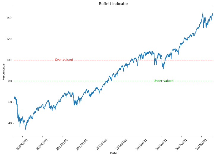
The figure looks OK, but lets clean it up a bit and add some labels to the axes. While we’re at it, lets add a horizontal line at 100% and 80%. I chose these values because the podcast that I was listening to (or perhaps it was a website I read…) mentioned that Warren Buffett suggests that if the Buffett Indicator is greater than 100% it means that the stocks are overvalued. However, if the Buffett Indicator is less than 80% it means that the stocks are undervalued. From this information, it would suggest that we should invest when the value is less than 80% and stop investing when the value is greater than 100%.
Note: I have little to no knowledge about investing. This post is just an exercise for me to learn to get stock information in Python. DO NOT invest based on the information in this post.
fig = plt.figure(figsize=(12,8))

plt.plot(combined.index.values,combined.Buffett_Indicator)

ax = plt.gca()

import matplotlib.dates as mdates
myFmt = mdates.DateFormatter('%Y%m%d')
ax.xaxis.set_major_formatter(myFmt)
ax.set_xlabel('Date')
ax.set_ylabel('Percentage')
ax.set_title('Buffett Indicator')
ax.set_xlim(min_date,max_date)

# Rotate the x-tick labels so that they are more legible
plt.xticks(rotation=45)

# Add the horizontal lines
plt.hlines(100,min_date,max_date,colors='r',linestyle='dashed')
plt.hlines(80,min_date,max_date,colors='g',linestyle='dashed')

plt.text(quarter_date,100,'Over-valued',ha='center',va='center',color='r',backgroundcolor='white')
plt.text(three_quarter_date,80,'Under-valued',ha='center',va='center',color='g',backgroundcolor='white')

plt.show()
And there we have it. We now have a figure showing the Buffett Index for the past 10 years. Obviously the Buffett Index alone isn’t a definitive predictor of the market, since it shows the stocks as over-values for the past few years, yet the market is still increasing.


Excellent article on the usage of Python for data analysis.
I would like to thank you much for this great post. It's
data science online training
very useful and helpful for anyone looking for tips. I like your writing style and I hope you will keep doing this good working.
This blog helps us to know about create a buffet indicator plot in phython. Thanks for sharing this blog.
I love python for being in all IT fields: Data science, web, desktop and more
Interesting and informative article. Thanks for sharing.